


TRI333PLE Rebranding
- Jake Goh
- Jan 29, 2024
- 1 min read

Updated: Feb 1, 2024

When I joined TRI333PLE, one of my first tasks was to rebrand the visual identity of the channel.


(Previous Logo, new Logo)
The previous logo is straightforward and direct, but the team faced an issue with recognisability and a lack of personality. The visual language didn't show what the channel was about.

(logo drafts)
I drafted a punch of different directions for the founders to get a sense check, to see what lines up with the vision they had for the channel.

(logo design process)
After setting the direction, I crafted a system to fit the logo into, with everything revolving around the number "3". The various lines are tilted at either 9, or 33 degrees, with each block in relation to each other also having the idea of "3" in the ratios.
Once the logo has been crafted, I animated it to be the opening stinger. The previous stinger also has a music hook that the founders grew attached to, but would like it to be stronger and more high energy. I took the hook and produced the music for the stinger, and the new branding was born!


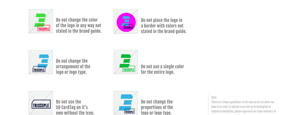


(Tri333ple condensed CI guide)


Comments